

After Reading this You will Never Ask for the Cheap Website to anyone.
A user's opinion of your website, which determines whether they like it or not and whether they'll stay or leave, is formed in about 50 milliseconds, or 0.05 seconds .
What it mean :
As common as it is to say, "don't judge a book by its cover," websites are subject to an extreme level of quick judgments that directly affect perceptions of credibility.
Why? It’s a simple matter of choice. Chances are for any given search query, there are multiple search results that fit the needs of the user.
It's simple economics: a surplus of good options drives down the price—or, in this case, the level of tolerance for bad websites. Yes, websites are judged quickly and harshly.
Still not convinced?
Check this out !
I think I know which website you're most likely to appreciate.
How to Fix It ?
The best (and only) way to eliminate snap judgments on your homepage is to improve its design. While this may appear to be a massive undertaking, you can continue reading and implementing what you've learned to ensure that your redesign avoids the fatal 0.05 seconds in the future.
57% of internet users say they won’t recommend a business with a poorly designed website on mobile
What it mean :
So, here's where responsive web design comes into play:
Websites that are not mobile responsive are by definition poorly designed because they do not deliver an optimal user experience.
No business wants their website visitors to be hesitant to refer them.
85% of adults believe that a company's website should be as excellent as or better than its desktop website when viewed on a mobile device.
Have a website that users need to pinch and zoom on their mobile devices to view? That user is as good as gone—and they should be able to figure that out in 0.05 seconds.
Nowadays, all website should feature responsive web design. In other words, the display of the website should adjust based on the pixel width of the website upon which it’s being viewed.
If you have a responsive website, aspect ratio becomes less important, because the priority is filling the screen on every device in a way that is legible, compelling and easy to navigate.
As of Q2 2018, smartphones held a 63% share of all retail website visits.
What it mean :
In tip #21, we'll learn that 50% of U.S. e-commerce sales occur on mobile devices.
If smartphones alone account for 63% of retail website visits, there must be a gap in the quality of retail mobile sites that causes conversion rates to be lower.
Still, 63%—a number primed to be bolstered by retailers putting more effort into their mobile shopping experiences—should be a large enough slice of the pie to drive retailers with poor mobile experiences to action.
38% of people will stop engaging with a website if the content or layout are unattractive
What it mean :
Congratulations! You got past the 0.05 seconds of doom. Now what?
Well, you’re not quite out of the weeds yet! In fact, any snag a user hits on your site—whether it’s related to design or navigation—can be fatal to your chances of turning that user into a lead.
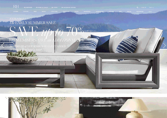
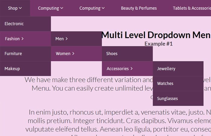
Here’s a great example:
Remember the Restoration Hardware homepage that I was praising in statistic #1? As it turns out, the cover looks a lot better than the book.
Design-wise, the site looks pretty good throughout, although this is helped in part by the great images of beautiful, luxurious products. But when it comes to the layout, the site can be a bit vexing.
When I hover over any category on the navbar, it gives me a dropdown menu. Nothing wrong with that—except for the fact that each dropdown menu has its own series of dropdown menus, creating a sea of nested content that can be extremely frustrating to find. Each one of the categories on the left has its own set of subcategories. Yikes!
Way too many options for my brain to handle
How to fix it :
Moral of the story?
Not all websites that look good initially are good at getting the job done and converting users into leads and customers. In fact, if a website slips up at any point, users have made it clear that they won’t tolerate it.
Of course, dropdown menus with oodles of nested content aren’t the only layout and navigation flaw in the book. There are thousands—and the only real way to find them on your website is to understand how users interact with it.
Remember, even books with great covers can get put down halfway through. Make sure your website is well designed and well structured from start to finish.
Remember, even books with great covers can get put down halfway through. Make sure your website is well designed and well structured from start to finish.
88% of online consumers are less likely to return to a site after a bad experience
How to fix it :
The internet doesn’t hand out second chances. In fact, everything we’ve learned so far tells us that bad website design, outdated aesthetics and low usability are major credibility killers.
Try to get to the root of the issue.
If your website hasn’t been updated or redesigned in 5 years, the answer is probably pretty simple: Implement some of our design tips from above and create a modern, responsive website.
But what if you recently completed a redesign and find that many users are bouncing, and your conversion rates are lower than expected?
77% of agencies believe that a bad website User Experience is a weakness for their clients.
This makes bad UX the most significant weakness agencies identified
It seems as if there may be a pattern here:
User experience and design are not separate concepts. They couldn’t be more connected.
39% of people will stop engaging with a website if images won’t load or take too long to load
What it means :
If a company fails to update and fix broken images on its website, what does that say about the company’s attention to detail and level of organization?
Probably not great things.
Similarly, images have the ability to significantly slow down the load time of the pages that house them, leading to even more user abandonment.
47% of Users expect a maximum of 2 seconds loading time for an average website
How to fix it :

If you look at this GIF long enough, it turns into a black button
Luckily, the culprit for slow load times of images is easy to identify: large file size. While it may be tempting to pepper your website with beautiful, high resolution images, it can greatly detract from your website’s effectiveness. In fact, not only does slow load time effect user behavior by causing users to leave your site, it also affects SEO.
Probably not great things.
Similarly, images have the ability to significantly slow down the load time of the pages that house them, leading to even more user abandonment.
Here’s a Free tool from Google to check the speed of your website’s pages, so that you can diagnose any potential loading issues.
And here’s a Great tool for optimizing the size of images with large file sizes.
Slow-loading websites cost retailers $2.6 billion in lost sales each year.
What it means :
Let’s be real—we all know what this means.
If you’re missing the mark when it comes to page speed, you’re also missing out on the chance to bring on new customers through your website.
75% of consumers admit to making judgements on a company’s credibility based on the company’s website design
What it means :
When you think about it, it’s pretty incredible that the credibility of a company is so powerfully linked to the aesthetic quality of its website.
But it’s 2022, and a website serves as a window into the way a company operates. As such, it needs to exude credibility in every sense of the word.
How to fix it :
When it comes to portraying credibility on a company website, step one is to have a modern, updated design that shows your company cares about its digital presence. This includes implementing all of the aspect ratio, image, font and layout information we discussed above.
But credibility is also driven through a website’s content, and content should always go hand in hand with design.
What do I mean?
A website’s content can be anything from images or videos displayed on the site to blocks of text describing your services, or a large headline. The way these pieces of content are integrated with your site’s design is just as important as what they say.
Good design relies on a seamless integration of quality, informative, and credibility-boosting content into the overall fabric of the site.
Make sure that your website’s content—whether in the form of images or text—reinforces its design. This way high quality aesthetics are bolstered with evidence of success, brand-defining statements, and images that keep users interested and engaged.
It takes 2.6 seconds for a user’s eyes to land on the area of a website that most influences their first impression
What it means :
As we learned from our first statistic, it takes much less than a second for a user to form their opinion on the quality of a website.
We also discussed the fact that once your website passes the snap judgement test, it will have to keep it up in order to retain the user’s positive impression.
The next hoop your website needs to jump through is the user’s first conscious impression, which is typically an area on the landing page that will influence their perception of the website’s quality.
Users take an average of 2.6 seconds to find this spot, so it’s important to be engaging right away.
How to fix it :
The key to creating a positive first impression is a combination of extreme clarity and quality design.
Every landing page should have a logical area where you want your user’s eyes to land. This area will most often be a line of text or media that introduces your company to the user.
Try using an F-Shaped pattern:
If you want users to gravitate toward something specific on your website, try pushing that image or multimedia toward the top left of the page, and maintaining that same structure throughout the site.
Eye-tracking studies analyzing user behavior have found that users mimic the way that they would read a book when they scan websites:
They start at the upper part of the content area, reading horizontally from left to right, then move down and read a smaller quantity of content from left to right.
Finally, users tend to scan the content’s left side vertically from top to bottom.
Try to order the pages of your website in this way, so that users see the content that will influence their credibility and potential purchasing decisions front and center.
Users spend an average of 5.94 seconds looking at a website’s main image
What it means :
Images are great. They add depth and significance to a user’s impressions of a website while spicing things up.
This statistic shows us that users do in fact pay attention to the main image on a web page, so it’s important to make sure that this image communicates effectively and reinforces the brand.
How to fix it :
Choose images that are relevant to your product or service offering and will not distract from the overall objective of the website.
Most importantly, don’t go overboard.
It may feel like an image slider is a good idea, because it gives you the ability to portray your company in multiple different settings, or allows you to pitch a variety of offers—but most statistics point to sliders actually having a detrimental impact on conversion and user opinion.
Sliders tend to distract users from what they were originally doing on your website. Not to mention, the fact that users only spend 5.94 seconds on the homepage image means that first image in the slider is usually the only one that users see.
In fact, here’s a chart from Instapage showing the massive discrepancy between click-through rates of slider images at different positions.

Goafreet Company
Guiding the wind to the future!
Learn & Solve
All
Digital Marketing
Pay Per Click
Search Engine Optimization
Social Media Marketing
Research and Case Studies
Services
Branding
UI / UX Designing
Graphics Designing
Website Development
Mobile App Development
Desktop App Development
Social Media Marketing
Search Engine Optimization
Online Reputation Management
Pay Per Click
Our Brands
Branding Inferno
D. Marketing Inferno
UI Inferno
Palette Inferno
Font Inferno
Logo Inferno
Industry Insights
Agriculture Industry
Aviation Industry
Bio Tech Industry
Construction Industry
Education Industry
Entertainment Industry
Film Industry
Finance Industry
Healthcare Industry
Manufacturing Industry
Salon Industry
Unleash the Impact
Website
Freemium Space
Everything Here
Branding Inferno
D. Marketing Inferno
The Cognitive Bias Codex
Design Tools
Monochromatic Color Palette
Complementary Color Palette
Analogous Color Palette
Split Complementary Color Palette
Tetradic Color Palette
Square Color Palette
Contrast Checker
Other Tools
Banned Hashtags Extractor
Echo Slug
Pages
Home
Our Work
Our Services
Are you in hurry ? Click Below .
Support
Customer Support
Chat Support
Chat on FaceBook Messenger
Policies
Terms & Condition
Privacy Policy